
Rangu
2026
A new kind of aperitif
When Brass Lion decided to create a new Asian aperitif, there was no brand, no story and no creative direction – just a product.
Starting from a blank canvas, I developed the brand from the ground up, creating everything from the name and positioning to the visual identity, packaging, website and launch campaign.
European aperitifs are steeped in ritual. Rangu was built to challenge that.
Rather than borrowing from the traditions of European aperitifs, Rangu reimagines the category through an Asian lens: playful, approachable and free from convention.
One of the biggest creative opportunities was giving the aperitif a personality beyond the bottle and reimagining what an aperitif could feel like through an Asian lens.
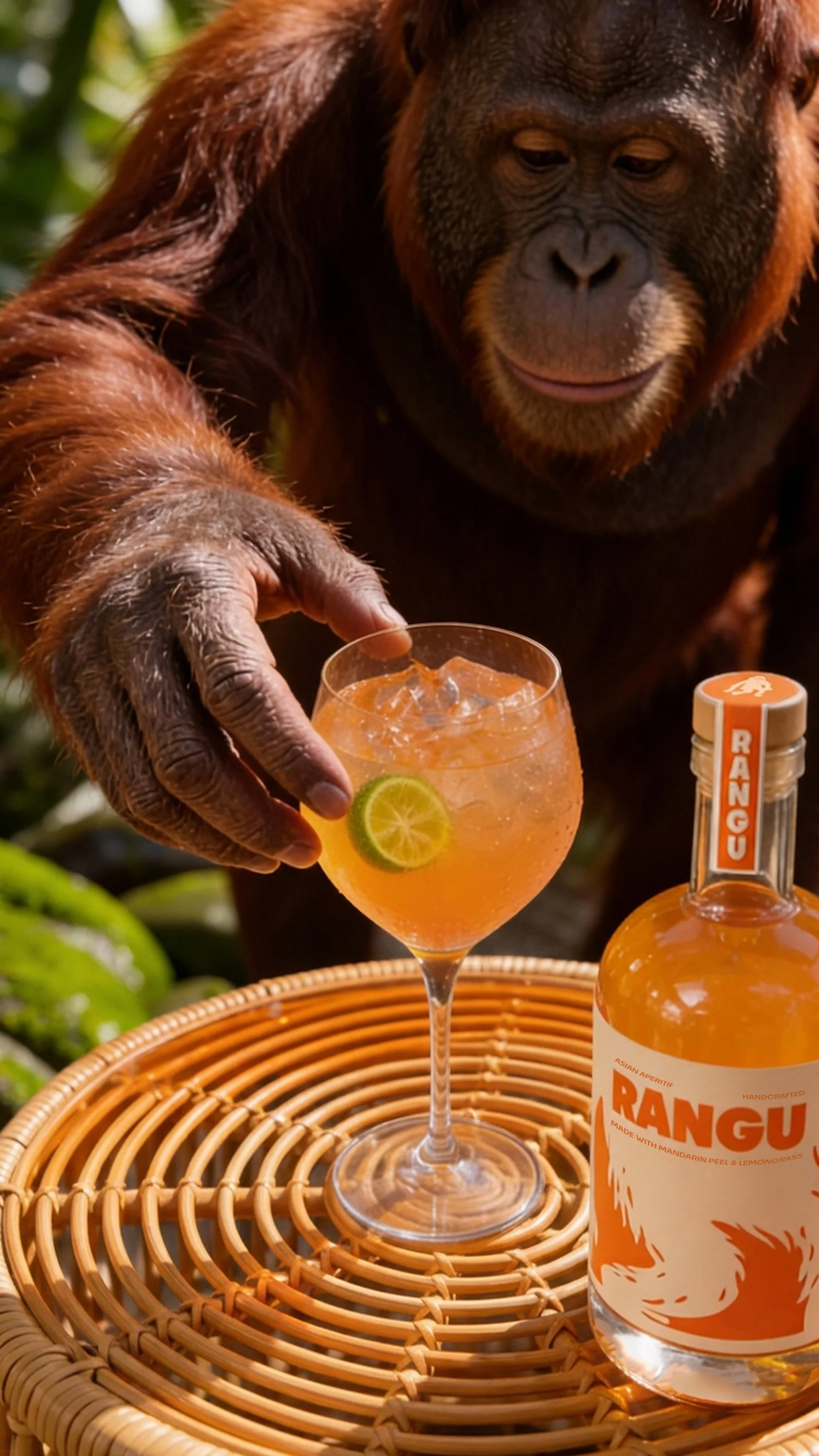
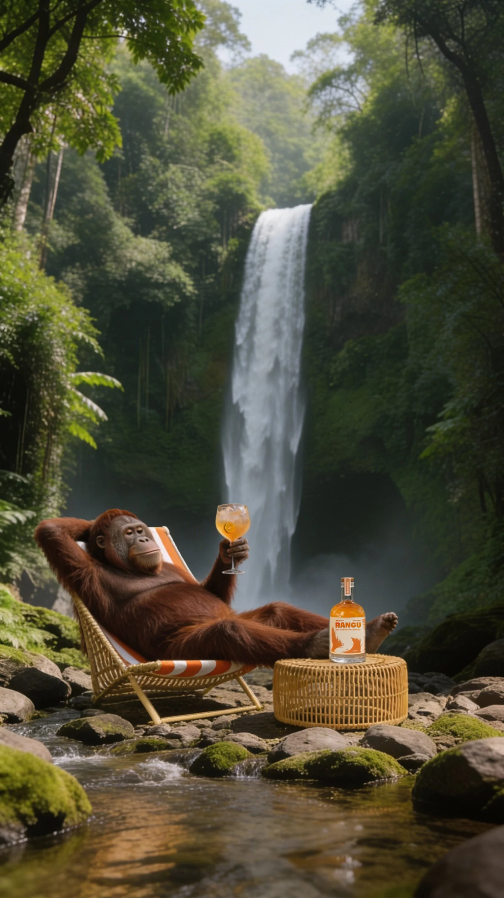
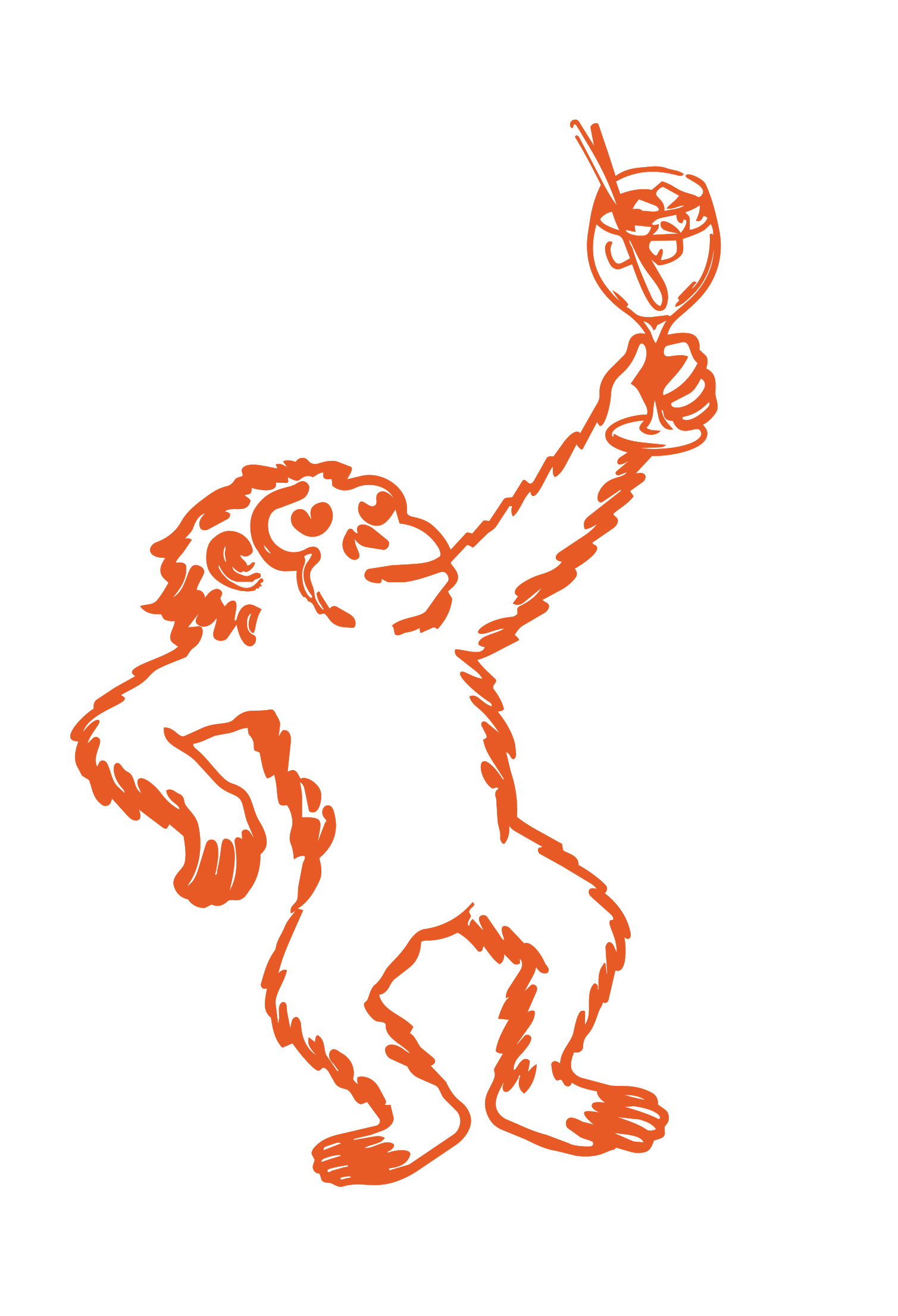
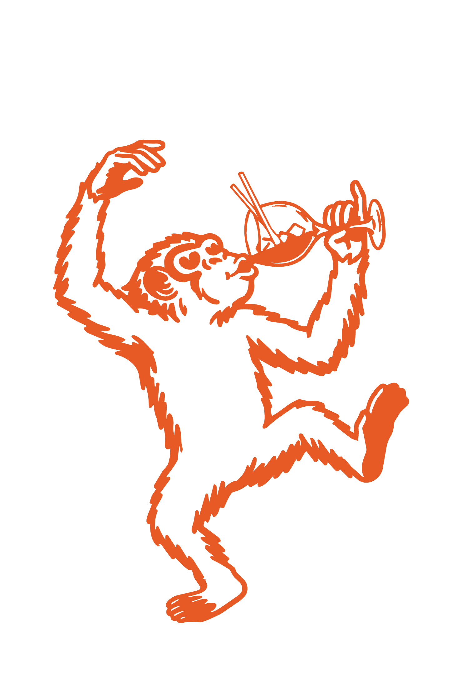
That thinking led to the name Rangu, inspired by the orangutan (which means "person of the forest" in Malay and Indonesian). Rather than becoming a traditional mascot, the orangutan becomes a recurring character woven throughout the experience. It appears across the website, campaigns, merchandise and activations, adding moments of surprise while reinforcing the brand’s identity.
Orangutans spend their lives exploring the rainforest canopy, moving with curiosity rather than urgency. We figured an aperitif should do the same.
This became the foundation for the entire brand: confident without being pretentious, premium without being exclusive, and playful without losing credibility.
Building the brand world
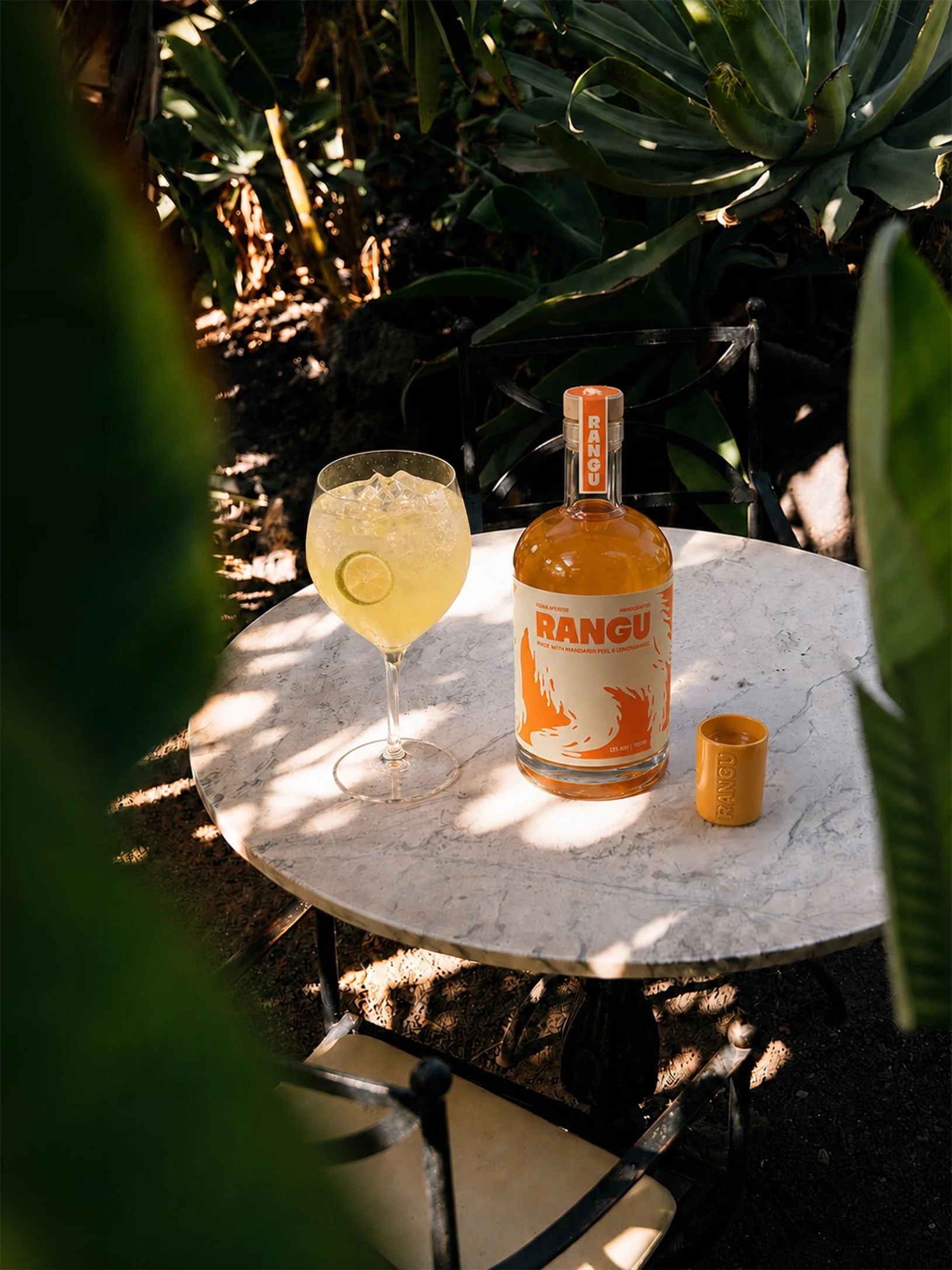
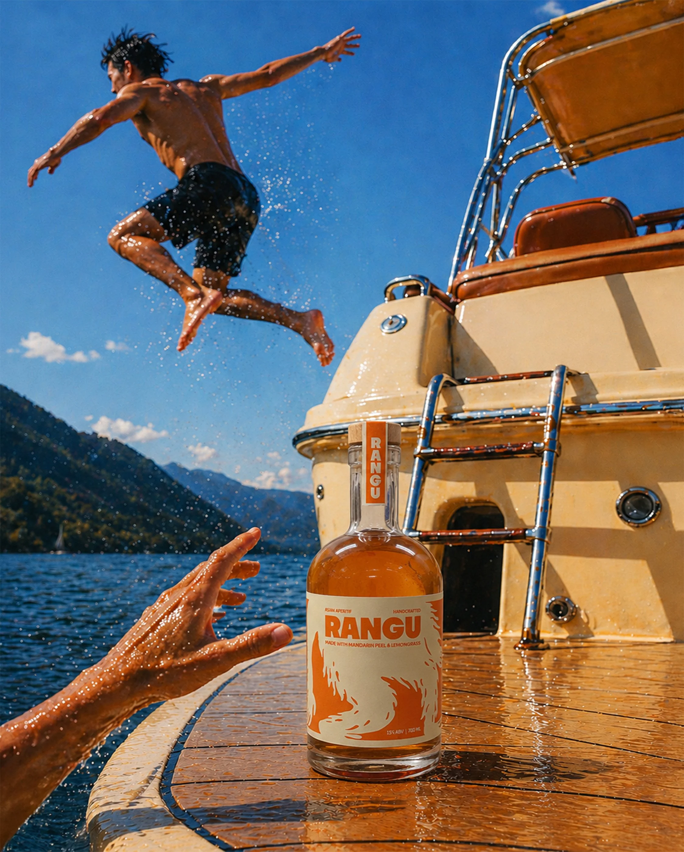
Every element of the identity was designed to feel effortless rather than ceremonial. Inspired by tropical citrus, warm afternoons and Southeast Asian landscapes, the visual system balances bold colour with clean typography to create a brand that's both premium and playful.
The orangutan became the connective thread across the identity, appearing in subtle ways throughout the brand.
The Identity

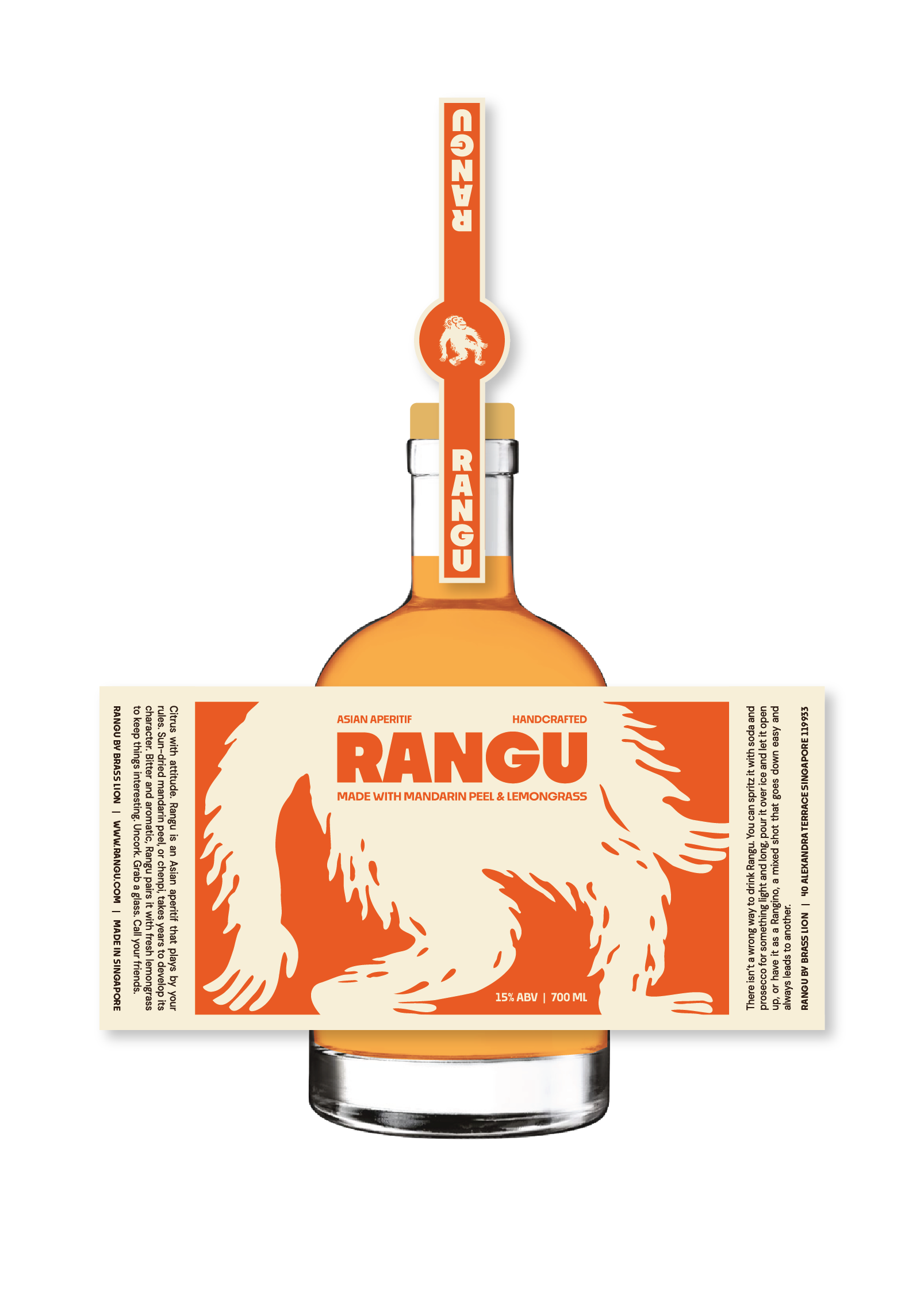
Packaging was the main touchpoint to introduce Rangu's personality. Rather than relying on ornate details common within the category, the bottle embraces a cleaner, more contemporary aesthetic that feels equally at home on a back bar or a beach table.
Packaging
The website extends the brand beyond the bottle. Every page was written and designed to feel conversational, rewarding curiosity through playful interactions, hidden details and copy that never takes itself too seriously.
Website

Currently
on ice.


Join the club to be first in line when we start pouring.
You're on the list!
Something went wrong. Mind trying again?
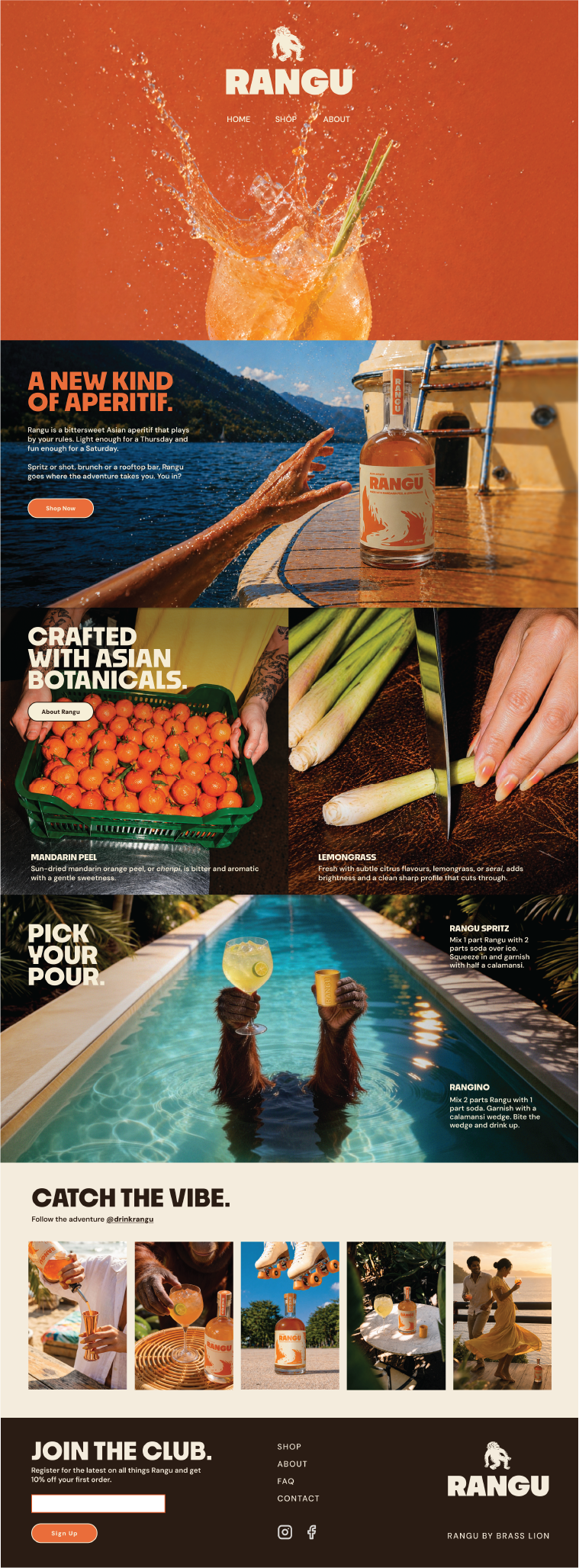
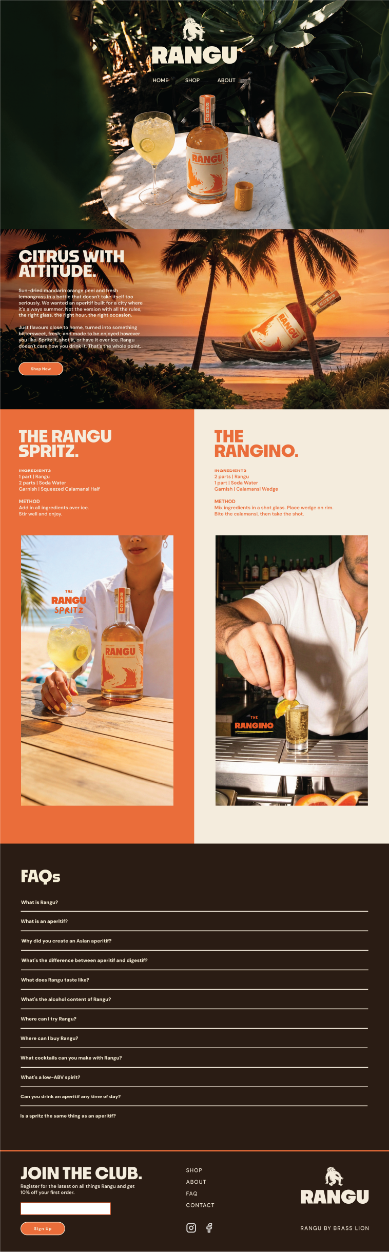
Social became an extension of the brand rather than simply another marketing channel. From cocktail recipes to cheeky captions and orangutan cameos, every post was crafted to reinforce Rangu's playful personality while encouraging discovery and conversation.
Socials
Rather than asking people to come to Rangu, the idea was to let Rangu find them.
Ring for Rangu is a roaming pop-up activation designed for bars across Singapore. Visitors ring a bell before an orangutan arm emerges through the wall, handing over a freshly poured Rangu Spritz. It's unexpected, playful and just surreal enough to stop people in their tracks.
By transforming the simple act of ordering a drink into an experience, the activation extends Rangu's mischievous personality beyond the bottle and into the real world.
Launch Activation
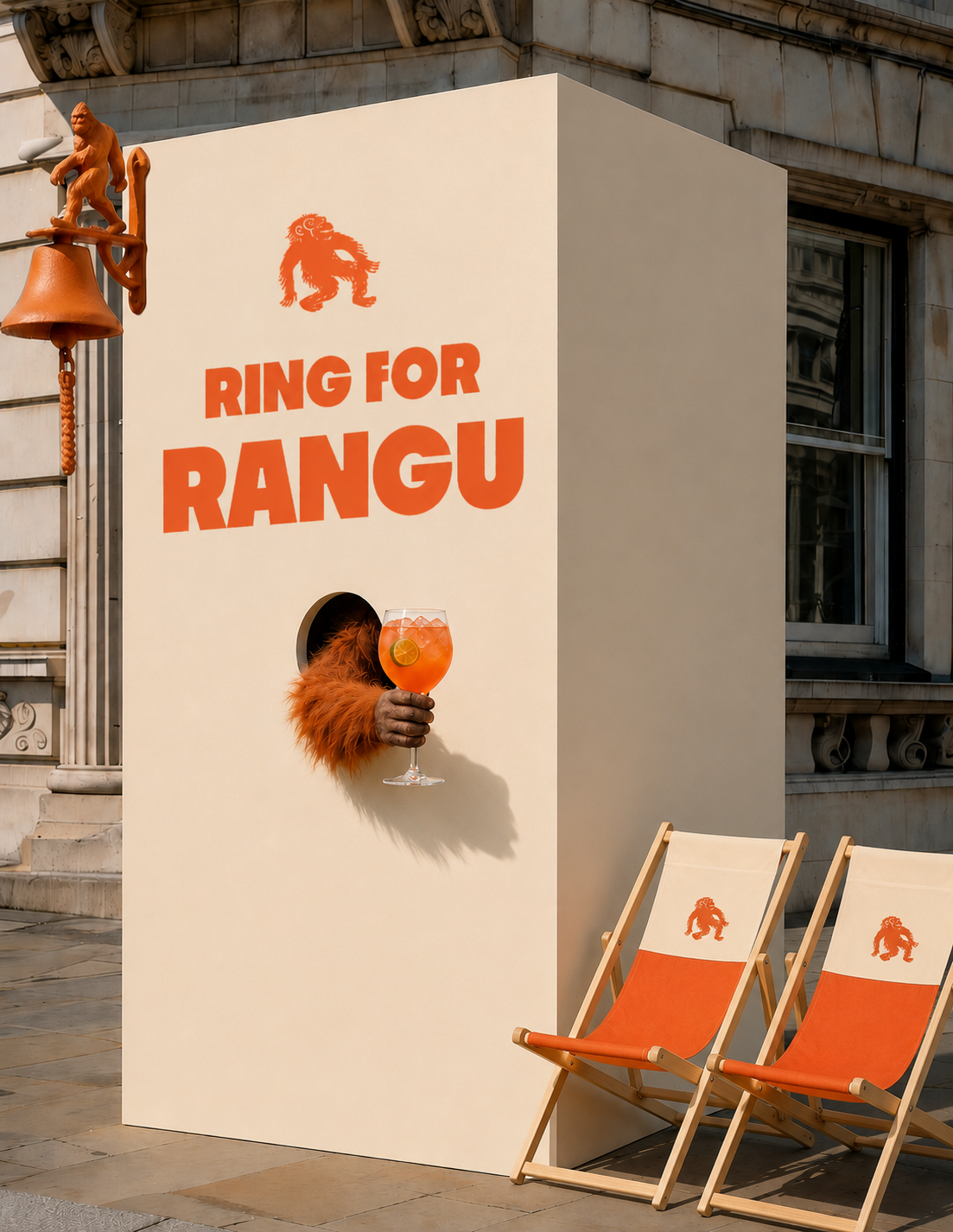
Concept visual